Trajectory
http://apptrajectory.com
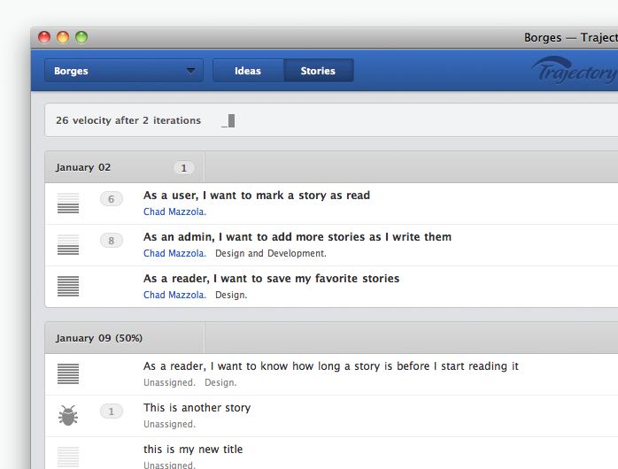
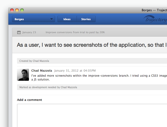
Trajectory is a agile project management tool run by thoughtbot.
The initial design of the product was a result of an interative process by several designers. Several months after launch, we felt that we had learned enough about the product to merit a redesign that would solve a variety of pain points our users were experiencing, as well as let us pay off technical debt in the front-end code.
I lead the redesign of the product, from sketching, to prototyping, to the final front-end build-out within the Rails app.
Radish
http://radishapp.com
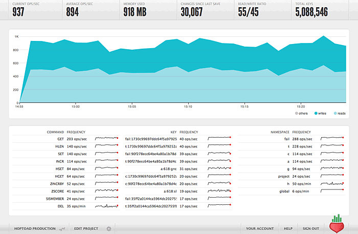
Radish is a monitoring and analysis service for redis developed and run by thoughtbot.
I lead the UI design and implementation of the product. The heart of the app is a dashboard that provides detailed information about Redis instances.
The marketing site and logo was designed by my co-worker Phil LaPier.
Natalie Erlich
natalie-erlich.com
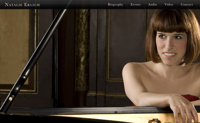
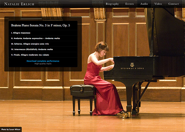
Natalie Erlich is a Boston-based classical pianist with an impressive resume and an excess of talent. Given the quality of the material being presented on her site, it made sense to use a modest and elegant design and let the content speak for itself.
Each page of Natalie's site features a full-screen photo of her. I designed a simple black bar that sits across the top of the page, with the main content complementing the photo it rests on top of.
With the launch of her site, Natalie has been able to reach a wider audience for her music and attract more attention from other members of the classical music community.
Boston Android Developers Group
bostonandroid.org
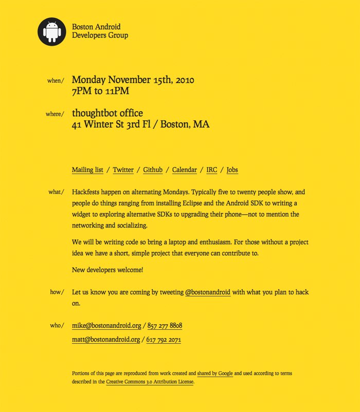
With this project, I wanted to pay homage to two classics of graphic design: Jan Tschichold's poster for Die Neue Typographie from 1928, and Peter Saville's 1978 poster for Factory Records that owes a debt to the same Tschichold poster. (See both on this blog entry I wrote about the project.)
A constraint of this project was that it would be handed off to a developer who would edit the site with nothing more than a text editor. I let the type be the focus of the design, using variation in size and spacing to structure the page. The site uses the lovely free typeface Prociono by Barry Schwartz.
CapeCo.de
capeco.de
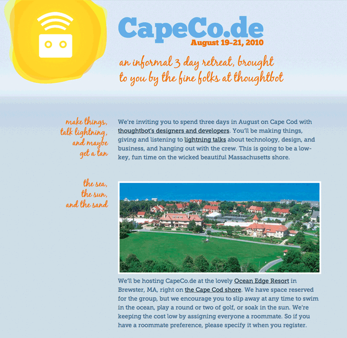
Capeco.de was an informal 3 day retreat put on by thoughtbot in August of 2010.
I designed and built this site in just a few days. The style makes a nod to vintage style, while retaining a modern feel. I took the site as a chance to play with embedded fonts, using the free typefaces Chunk Five, Blackjack, and Museo Slab.
Kimberly Ashton
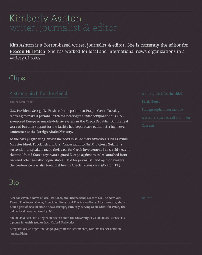
Kim is a Boston-based writer, journalist and editor who needed a place to share her work with other journalists. I made her a one page site that lets typography and color carry the weight of the design.
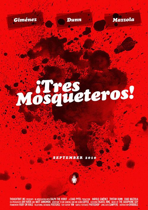
¡Tres Mosqueteros!
Every two months, thoughtbot does a team rotation. These teams are typically made up of two to four developers and one designer. At the beginning of a new team rotation in September, I decided to design a poster for my team. Some quick brainstorming on a name gave me a concept that I took home with me over the weekend. The end result is something that wouldn't seem out of place as a poster for a Quentin Tarantino re-make of the 1942 Mexican original.
You can read a blog post that explains the team concept more, and shows the posters the other designers at thoughtbot designed for their teams.
